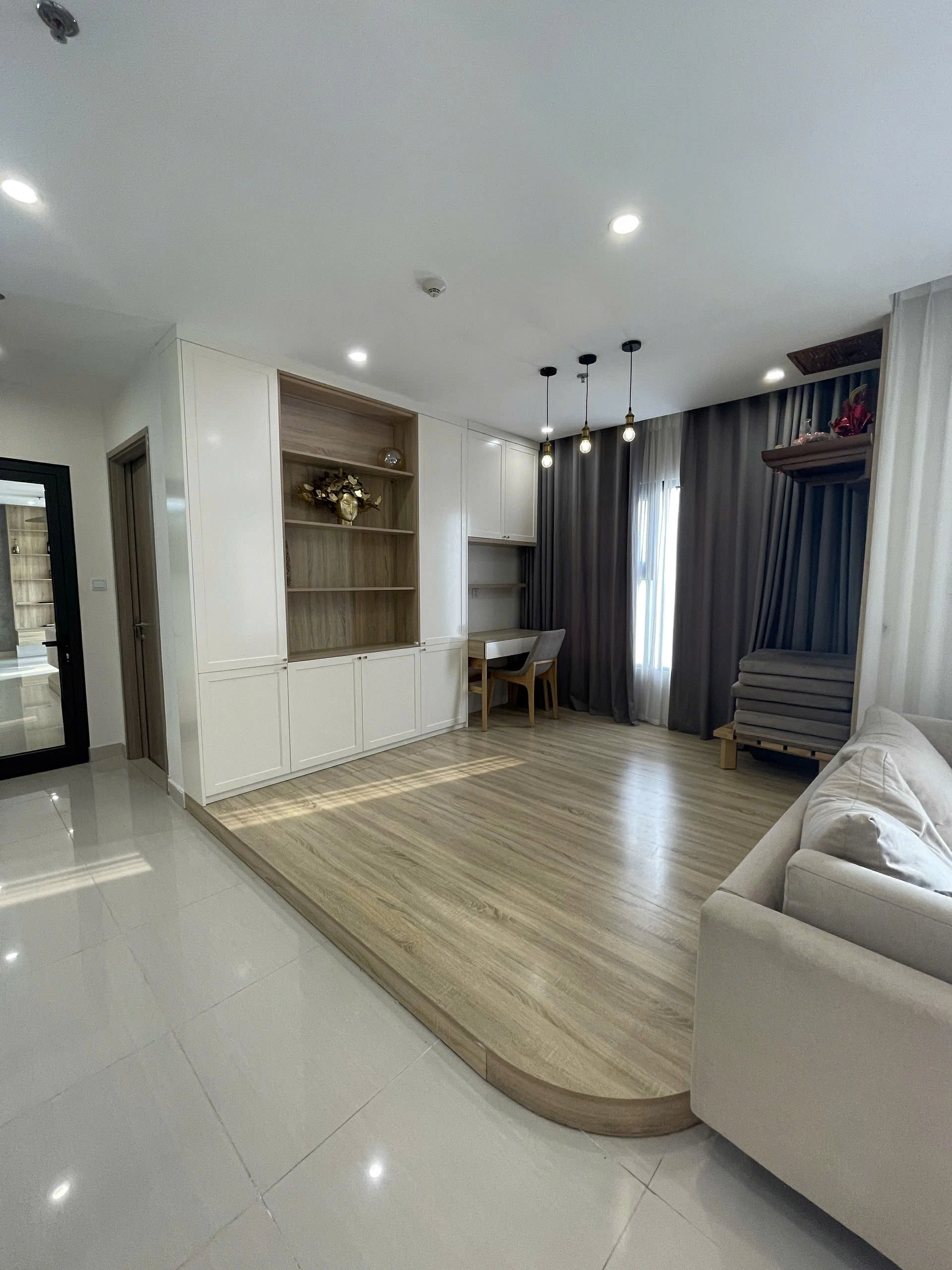
- Subtle palettes for modern home design and creating truly personal interiors
- The Power of Neutral Tones
- Layering Textures for Visual Interest
- Embracing Earthy Tones
- Integrating Natural Materials
- The Softness of Pastel Hues
- Balancing Pastels with Neutrals
- The Psychology of Color in Home Design
- Creating a Personal Narrative Through Design
Subtle palettes for modern home design and creating truly personal interiors
The realm of interior aesthetics, often referred to as home design, is a multifaceted discipline that goes far beyond mere decoration. It's about crafting spaces that reflect personality, enhance lifestyle, and promote well-being. A thoughtfully designed home isn't just visually appealing; it’s functional, comfortable, and a true sanctuary from the outside world. The principles of good design are constantly evolving, but the core tenets of balance, proportion, and harmony remain timeless. We’ll explore how subtle color palettes and careful material choices can elevate a space from ordinary to extraordinary.
Modern trends are leaning towards minimalism and intentionality, a movement away from cluttered spaces and towards a more curated approach to living. This doesn’t necessarily mean sacrificing comfort or personality, but rather embracing quality over quantity and focusing on creating spaces that truly resonate with the inhabitants. Consideration for natural light, the flow of movement, and the integration of personal touches are key to achieving a harmonious and inviting atmosphere. It’s about building a home that supports your life, rather than dictating it.
The Power of Neutral Tones
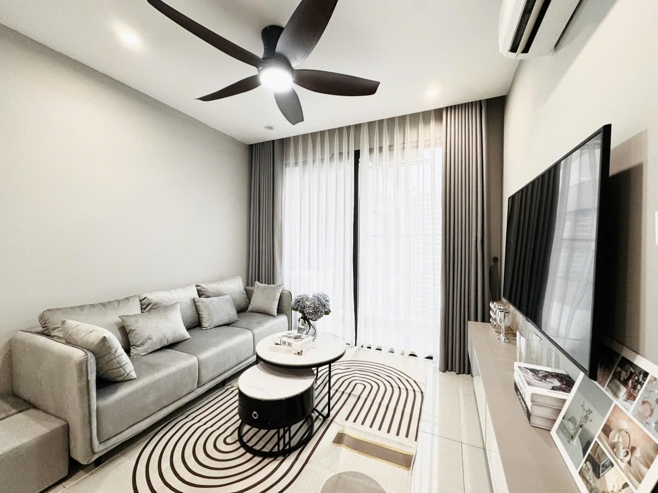
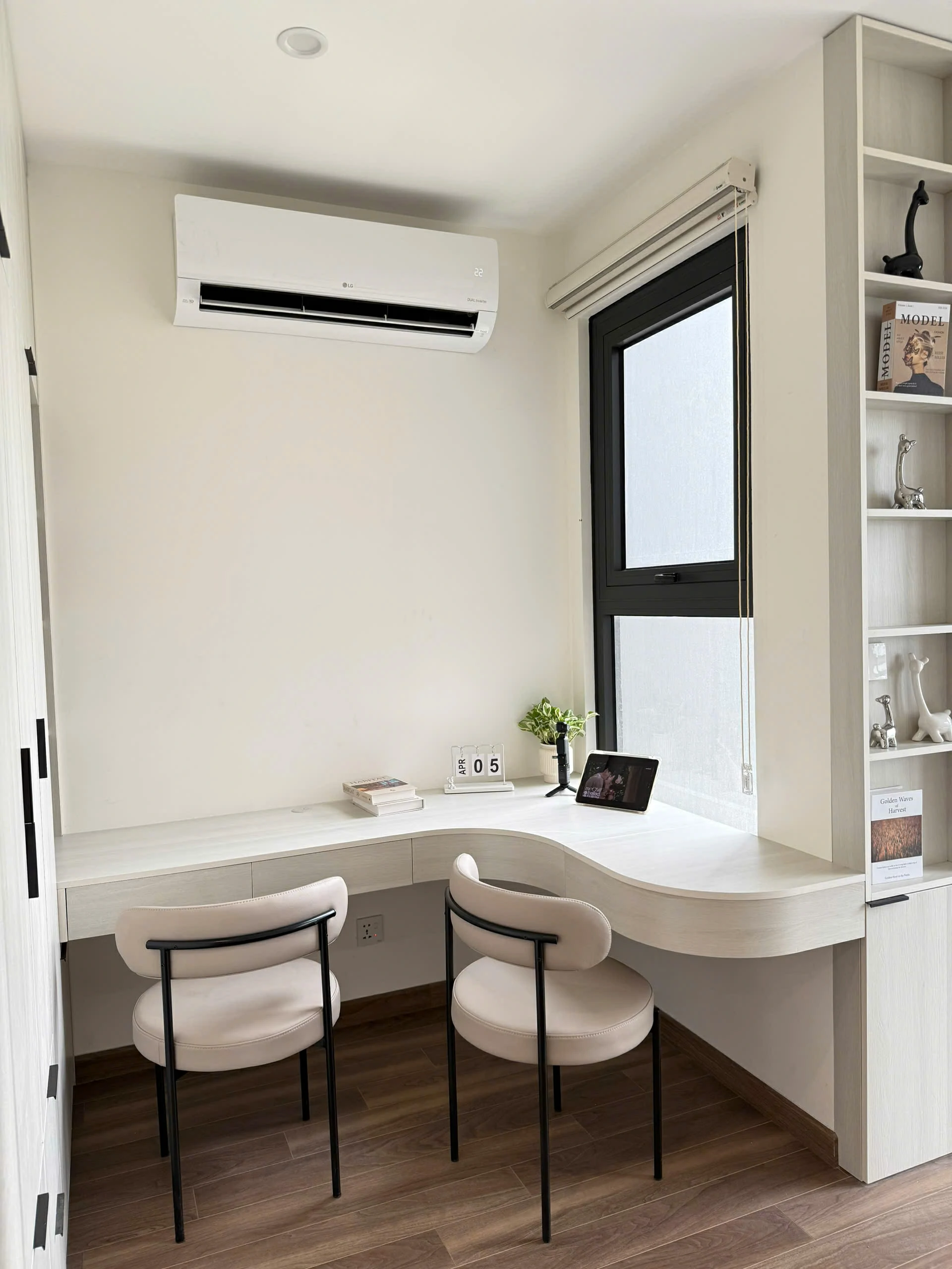
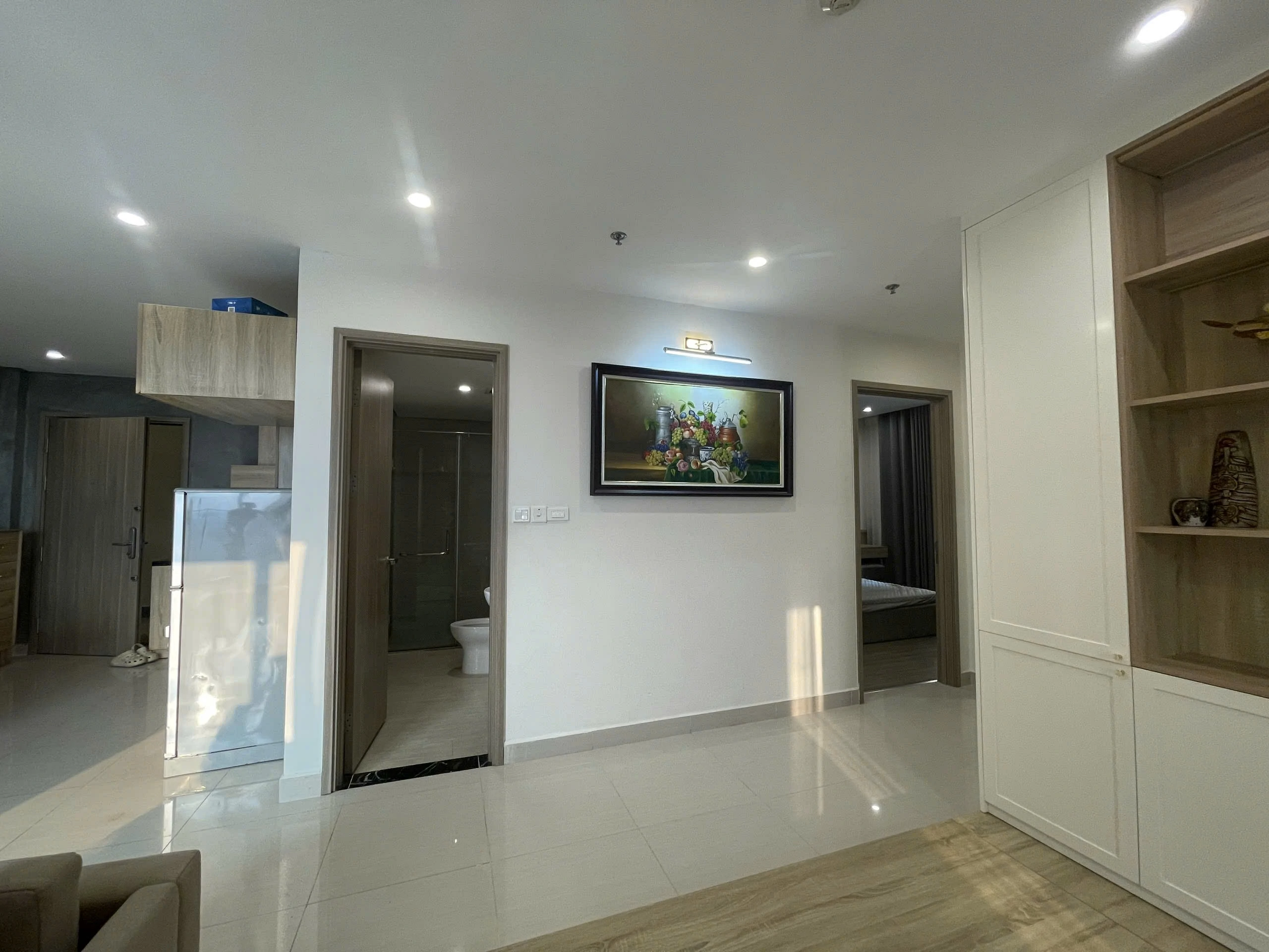
Neutral color palettes have become incredibly popular in modern interiors, and for good reason. They offer a sense of calm and sophistication, providing a versatile backdrop for incorporating other design elements. Think beyond just white; shades of gray, beige, and greige (a blend of gray and beige) offer subtle warmth and depth. The beauty of these tones lies in their ability to adapt to various lighting conditions and complement a wide range of furniture styles. A neutral base allows you to be bolder with accent colors, textiles, and artwork without overwhelming the space. They create a foundation of serenity and timelessness, enabling you to evolve your décor over time.
Layering Textures for Visual Interest
While a neutral palette might seem understated, it doesn't have to be boring. The key to adding visual interest lies in layering textures. Combine smooth surfaces like polished concrete or glass with rougher textures like natural wood, woven rugs, and linen upholstery. This creates depth and dimension, preventing the space from feeling flat or sterile. Consider incorporating different materials – velvet, leather, wool, cotton – to add tactile appeal. Even subtle variations in texture can make a significant impact, enhancing the overall sensory experience of the room. The interplay of light and shadow on these textures further adds to the richness of the design.
| Warm White | 85-90 | Walls, ceilings, trim | Gray accents, natural wood tones |
| Light Gray | 60-70 | Walls, furniture, large textiles | Warm whites, pops of color |
| Greige | 50-60 | Walls, upholstery, flooring | Creamy whites, muted blues |
| Charcoal Gray | 20-30 | Accent walls, furniture pieces | Bright whites, metallic accents |
Choosing the right LRV is critical. A higher LRV indicates a more reflective surface, making the color appear lighter and brighter. This is especially important in rooms with limited natural light. Conversely, a lower LRV creates a more subdued and dramatic effect, perfect for accent walls or areas where you want to create a cozy atmosphere.
Embracing Earthy Tones
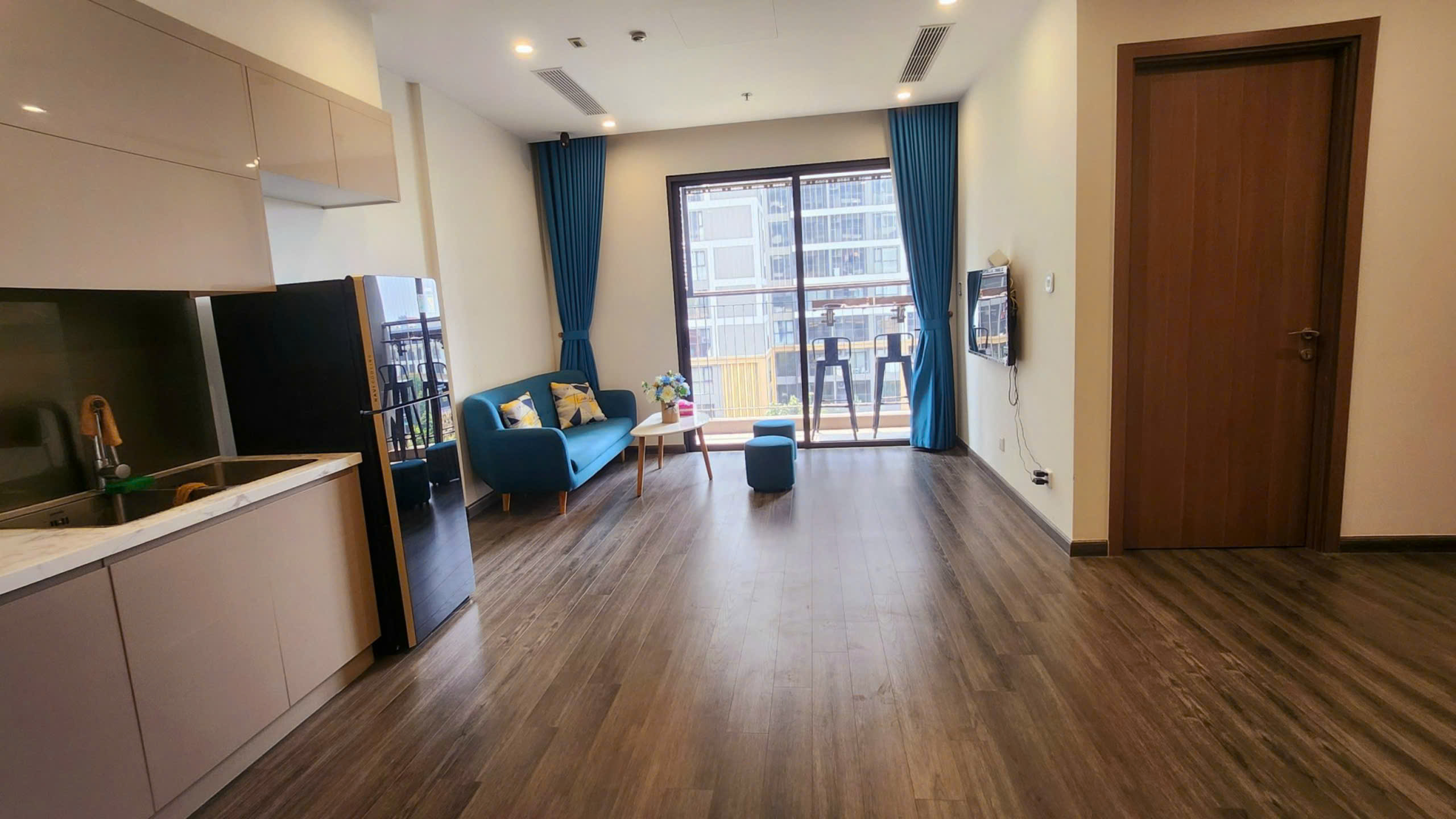
Moving beyond grays and whites, earthy tones offer a connection to nature and create a warm, inviting ambiance. Think of the colors found in landscapes – the browns of soil, the greens of foliage, the ochres of rock formations. These hues are inherently grounding and promote a sense of tranquility. Terracotta, olive green, and muted browns are all excellent choices for creating a soothing and organic feel. Earthy tones work particularly well in spaces where you want to foster relaxation, such as bedrooms and living rooms. They also provide a beautiful backdrop for showcasing natural materials like wood, stone, and plants. This palette lends itself seamlessly to various design styles, from bohemian to rustic to contemporary.
Integrating Natural Materials
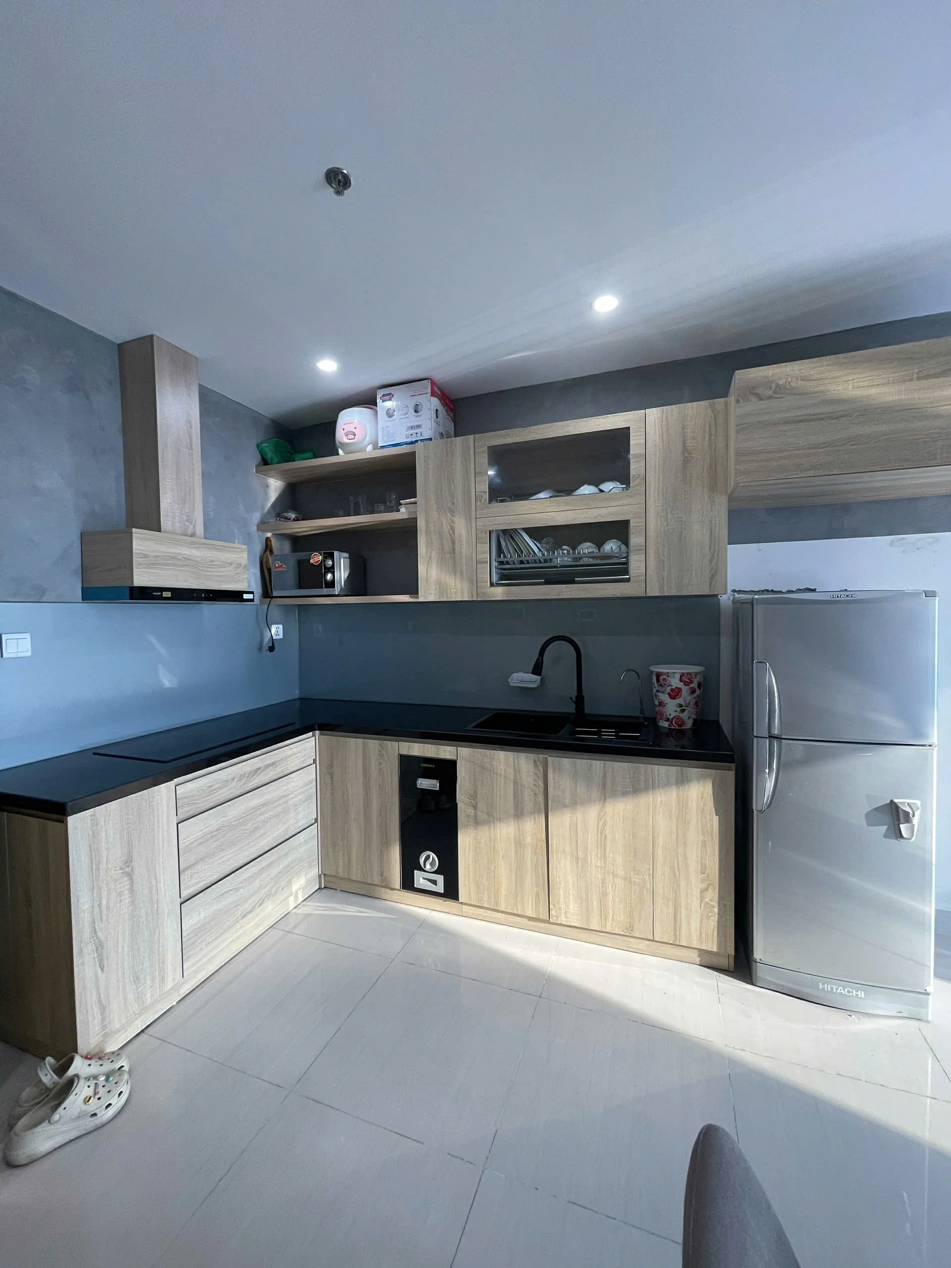
To amplify the effect of earthy tones, incorporate natural materials into your design scheme. Wooden furniture, woven baskets, stone countertops, and linen textiles all contribute to a sense of authenticity and warmth. Consider using reclaimed wood for a rustic touch or incorporating natural stone for a more sophisticated look. Plants are also essential, bringing life and vibrancy to the space. Not only do they add visual appeal, but they also improve air quality and create a more relaxing atmosphere. The combination of earthy tones and natural materials is a powerful way to connect your home to the outdoors and create a truly serene environment. Focusing on sustainability in materials selection further enhances this connection.
- Prioritize natural light sources and maximize their impact.
- Incorporate textures through a variety of materials – wood, stone, fabric.
- Use a consistent color palette throughout the home for a cohesive look.
- Don’t be afraid to experiment with different shades of the same color.
- Add personal touches to reflect your personality and style.
These elements aren’t just aesthetic choices, they are ways to build a space that feels authentically you. Consider what colors and materials bring you peace and happiness, and incorporate them into your design scheme. The goal isn't to follow a trend blindly, but to create a home that truly reflects your values and lifestyle.
The Softness of Pastel Hues
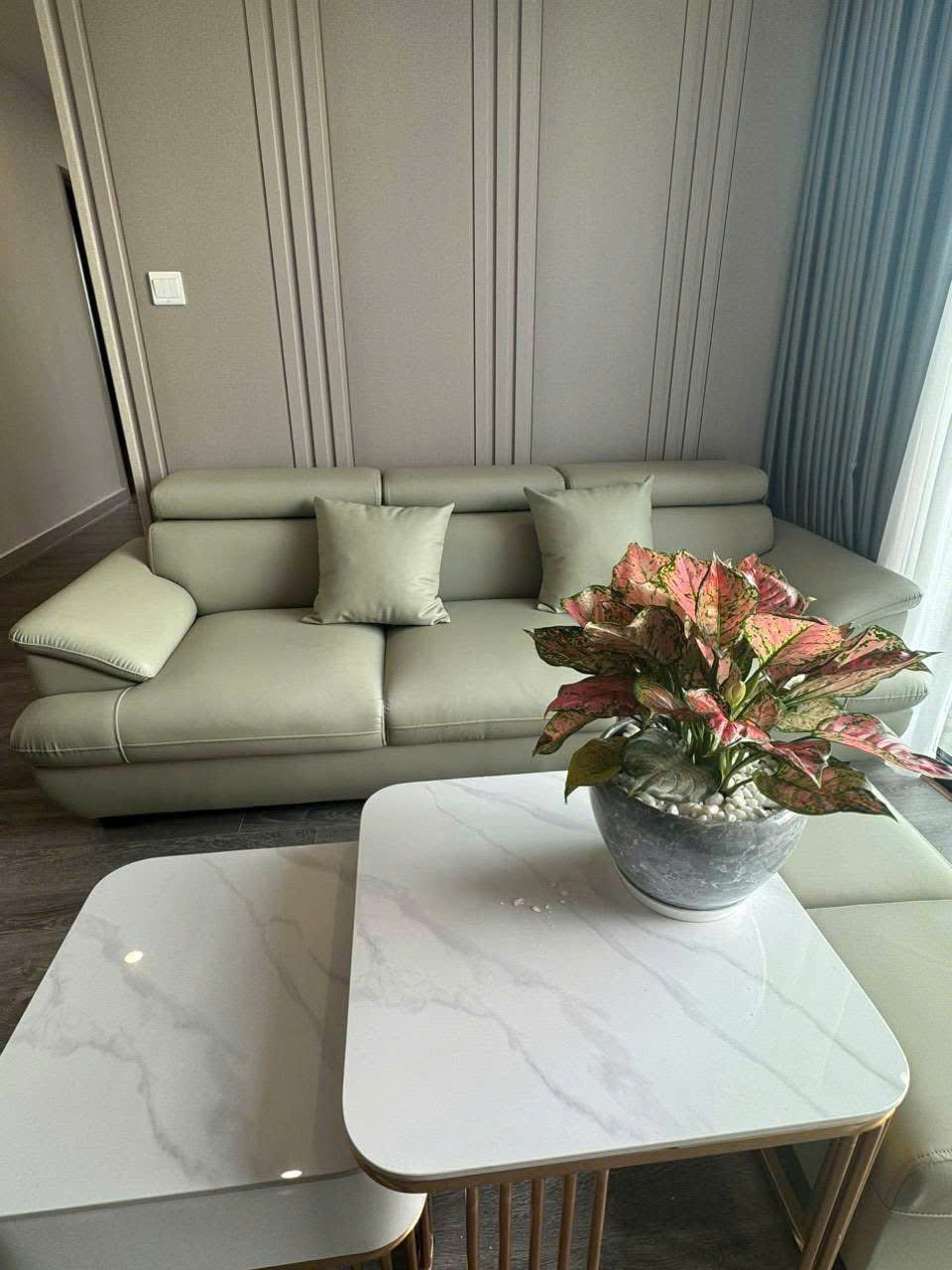
Pastel hues offer a delicate and sophisticated alternative to bolder colors. These soft shades – blush pink, lavender, mint green, and baby blue – create a calming and airy atmosphere. They're particularly effective in spaces where you want to create a sense of serenity and tranquility. Pastels work beautifully in bedrooms, bathrooms, and nurseries, but they can also be used effectively in living areas to soften the overall look. The key to using pastels successfully is to balance them with neutral tones and avoid overdoing it. A little pastel can go a long way in creating a peaceful and inviting space. They are particularly effective when paired with metallic accents like gold or silver.
Balancing Pastels with Neutrals
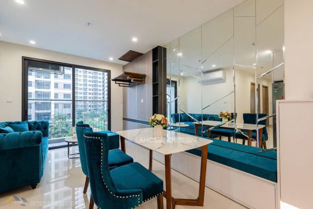
To prevent a pastel palette from feeling overly sweet or childish, it’s essential to balance it with neutral tones. Pair blush pink with gray or beige, lavender with white or cream, and mint green with light wood tones. These neutral hues ground the pastel shades and prevent them from overwhelming the space. Also, consider using different textures to add depth and dimension. A plush velvet sofa in a pastel shade can be balanced by a rough-hewn wooden coffee table. Don’t be afraid to experiment with different combinations to find what works best for your space. Ultimately, the goal is to create a harmonious and inviting atmosphere that feels both stylish and comfortable.
- Start with a neutral base – walls, flooring, and large furniture pieces.
- Introduce pastel hues through accent pieces – pillows, throws, artwork.
- Balance pastels with textured elements – wood, stone, metal.
- Consider using metallic accents to add a touch of sophistication.
- Experiment with different color combinations to find what works best for your space.
The successful implementation of pastels often comes down to a careful and considered approach. It’s about understanding how these soft colors interact with light and texture, and using them to create a space that feels both visually appealing and emotionally soothing. Remember that your home should be a reflection of your personal style, and pastels can be a wonderful way to express your creativity and individuality.
The Psychology of Color in Home Design
Color profoundly impacts our mood and emotions, making it a crucial element in home design. Understanding the psychology of color allows us to create spaces that support our well-being and enhance our daily lives. For instance, blue is known for its calming and soothing properties, making it ideal for bedrooms and bathrooms. Green is associated with nature and renewal, promoting a sense of peace and tranquility. Yellow is cheerful and uplifting, but should be used sparingly as it can also be overwhelming. Red is energetic and stimulating, best reserved for accent pieces or areas where you want to create a focal point. Carefully considering the psychological effects of color can help you create a home that feels truly harmonious and supportive.
Creating a Personal Narrative Through Design
Ultimately, the most successful home design is one that tells a story. Your home should be a reflection of your experiences, your passions, and your personal style. Don’t be afraid to incorporate items that have sentimental value – family heirlooms, travel souvenirs, artwork you’ve collected over the years. These pieces add character and depth to your space, making it feel truly unique. Consider creating a gallery wall featuring photographs and artwork that capture meaningful moments. Displaying objects you love is a powerful way to create a home that feels personal and inviting. It's a space that not only looks beautiful but also resonates with your soul. Thoughtfully curated items tell a story – your story – and create an atmosphere of warmth and authenticity.
Think about how you can integrate elements that reflect your hobbies and interests. If you’re a book lover, create a cozy reading nook with comfortable seating and ample lighting. If you enjoy cooking, design a kitchen that is both functional and stylish. Your home should be a sanctuary where you can pursue your passions and express your creativity. It's about more than just aesthetics; it’s about creating a space that nurtures your spirit and supports your well-being. This personalized approach will transform your house into a true home, a place where you feel truly comfortable and inspired.